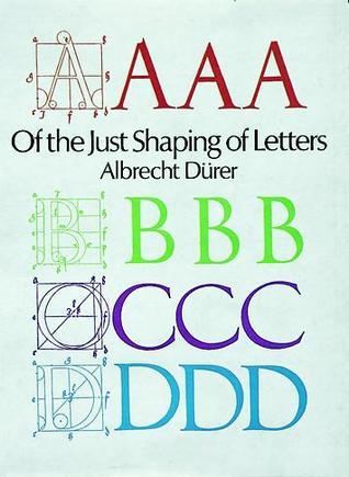
Of the Just Shaping of Letters
1965
First Published
3.95
Average Rating
46
Number of Pages
Printed in an edition limited to 315 copies, signed by Bruce Rogers. Asaf no.70, Warde 126 . The first of the Grolier Club's publications on the Roman alphabet, the work was designed by Bruce Rogers, using his Centaur types. It was printed on English hand-made paper at the Mall Press by Emery Walker and Wilfred Merton at Sussex House, Upper Mall, Hammersmith. The translation of the original Latin edition of 1535 is by R. T. Nichol. The Roman letters have been adapted from Dürer's 1525 original blocks, which were reprinted for the last time in 1604. Daniel Gehnrich is one of the few bookbinders here in the United States who works in vellum with the skill demanded by that elegant-but-difficult material. He studied bookbinding in Berlin and practices his art in central Massachusetts, employing old world techniques unknown to the majority of his colleagues. His design for the book complements perfectly the ideas expressed in the Grolier Club's first book devoted to the Roman alphabet. iv, 40, 4 pages. full natural vellum with the design stamped on the front cover in colored foils and gilt. The title of the book appears in rich gilt, centered on an arras stamped in red, the Dürer monogram is stamped in black below. The monogram is repeated on the rear cover in blind. Matching vellum clamshell box.. tall 4to..
Avg Rating
3.95
Number of Ratings
21
5 STARS
38%
4 STARS
24%
3 STARS
33%
2 STARS
5%
1 STARS
0%
goodreads
Author
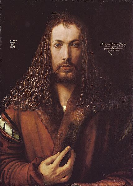
Albrecht Dürer
Author · 7 books
German painter and engraver Albrecht Dürer incorporated the classicism of the Renaissance of Italy into northern European art. This printmaker and theorist hailed from Nuremberg. https://en.wikipedia.org/wiki/Albrech...